Project Type
App Feature Design
Duration
3 Weeks
Scope of Work
UX Research
Product Design
UI Design

Small Changes, Big Lift

Design and experiments to drive growth for Fleetio's Shop Network

Project Type

B2B SaaS, in-house growth design project, web app.

My Role

Sole designer for Shop Network growth squad: ideation, design, QA, experiment analysis.

Team

1 designer (me), 1 PM, and 2 engineers from Growth Team.

Timeline

Q3 - Q4, 2025 with individual experiments running about 5 weeks each.
Project Overview

About Fleetio

Fleetio is fleet management software that helps fleets of all sizes track vehicles, schedule maintenance, and keep their entire operation in one place.

About Shop Network

One of the biggest values Fleetio offers is Shop Network, which connects fleets to repair shops, streamlining service, payments, approval, and invoicing for all outsourced maintenance.

Shop Network is already included in most plans; it's free to use once enabled. To enable the feature, users will need to complete a 3-step onboarding.

Growth Mission

The growth team worked across every aspect of the product, but I was on a squad dedicated to Shop Network.
Despite Shop Network being free and praised for its convenience, only a small number of eligible accounts were using it. Most eligible accounts never even started the enablement process.
Our mission was to improve Shop Network enablement by funneling more eligible users through to start onboarding.
Some Key Experiments I Designed and Shipped That Moved the Needle
Experiment 1
Persistent CTA on Shop Directory
Conversion from Shop Directory to onboarding start went up by 4.5x, and the Directory page became a real enablement path
Experiment 2
Shop Network Nudge on Issues Page
Direct visits from the Issues page to onboarding page went from 0 to 231 in a month, creating a new enablement entry point
Growth centers on conversion, but conversion shouldn't take over user goals. Everything I designed had to earn its place: lead with value, show up where it's relevant, and respect the work the user came to do.
Experiment 1 - Persistent CTA on Shop Directory

Problem

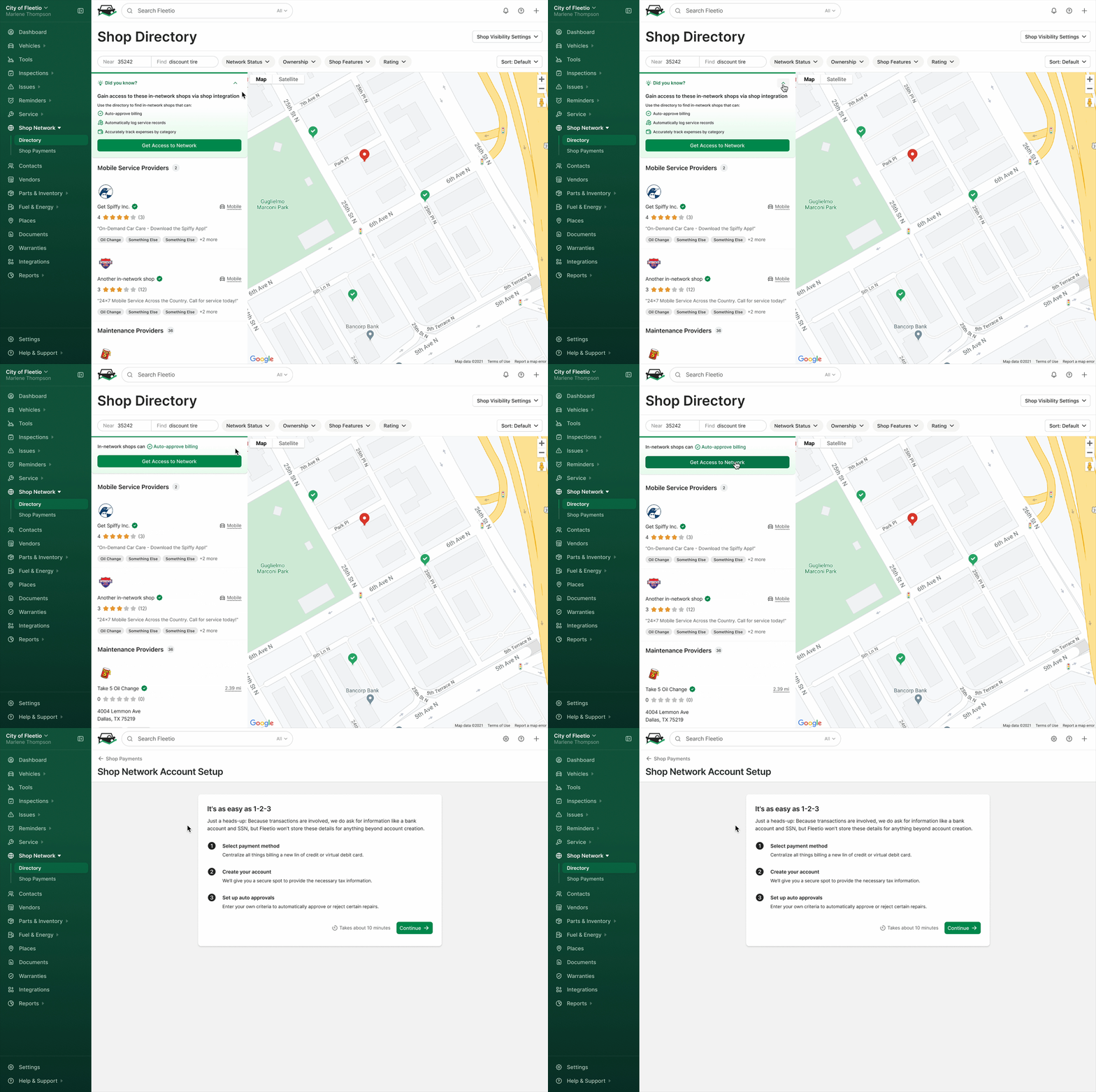
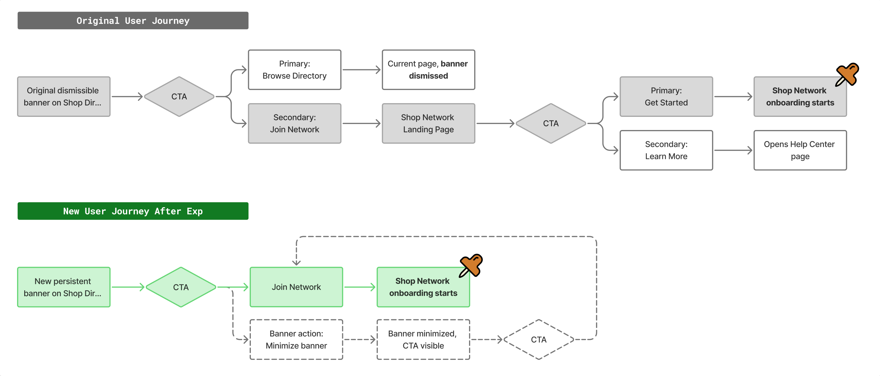
On the Shop Directory, fleets that had not enabled Shop Network would see a "Did you know" banner that explained the benefits of the feature. The primary button on the banner said "Browse Directory", but clicking it dismissed the banner entirely. So the loudest button made the thing we wanted people to notice disappear.

Discoverability was the obvious issue, but there was another problem dragging down Shop Network enablement. The path to enablement relied on the secondary button, "Join Network". Clicking it took users to a landing page that repeated the pitch, then asked them to click again to start onboarding. Every extra step was another chance to exit.

Solution

Since onboarding start marks enablement, conversion from Directory to onboarding start was our primary success metric.

Making the CTA permanently visible sounds like an obvious choice; however, a banner that never goes away becomes a nuisance. The solution was a CTA that was easy to rediscover even after being dismissed. The extra step in the conversion funnel also needed to be addressed, so here is how I tackled both with one design:

Design Details

Minimized in size, not in impact

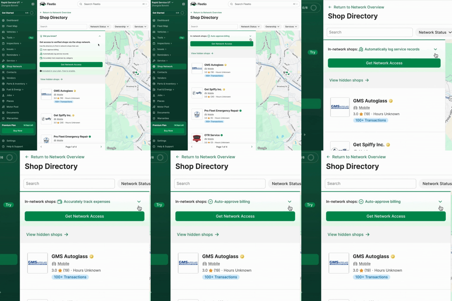
The expanded banner had three value propositions on top of the buttons to help motivate users. Collapsing it meant far less room, so I wanted to preserve both the value and the CTA in the collapsed state.

Here are three design decisions that made it small but mighty:
  • Maintaining the size of the CTA button to maximize visibility
  • Animated value line shuffling through three value propositions to keep all of them in sight
  • Allowing users to expand the banner after collapsing it

Experiment Design

This experiment was implemented as an A/B test with an equal split of traffic to Control and Treatment.

The Results

After five weeks, the persistent CTA banner was a clear win with significant lifts on both engagement and onboarding start.
Metric Control Variant
Desired CTA engagement 1.6% 5.8%
Conversion to Shop Network onboarding start 4.5% 20.1% (winner)
We shipped the treatment to all users after the experiment. Although we shipped multiple changes at once and it's hard to attribute the success to a single lever, I believe a persistent presence and a shorter path from impression to action both contributed.
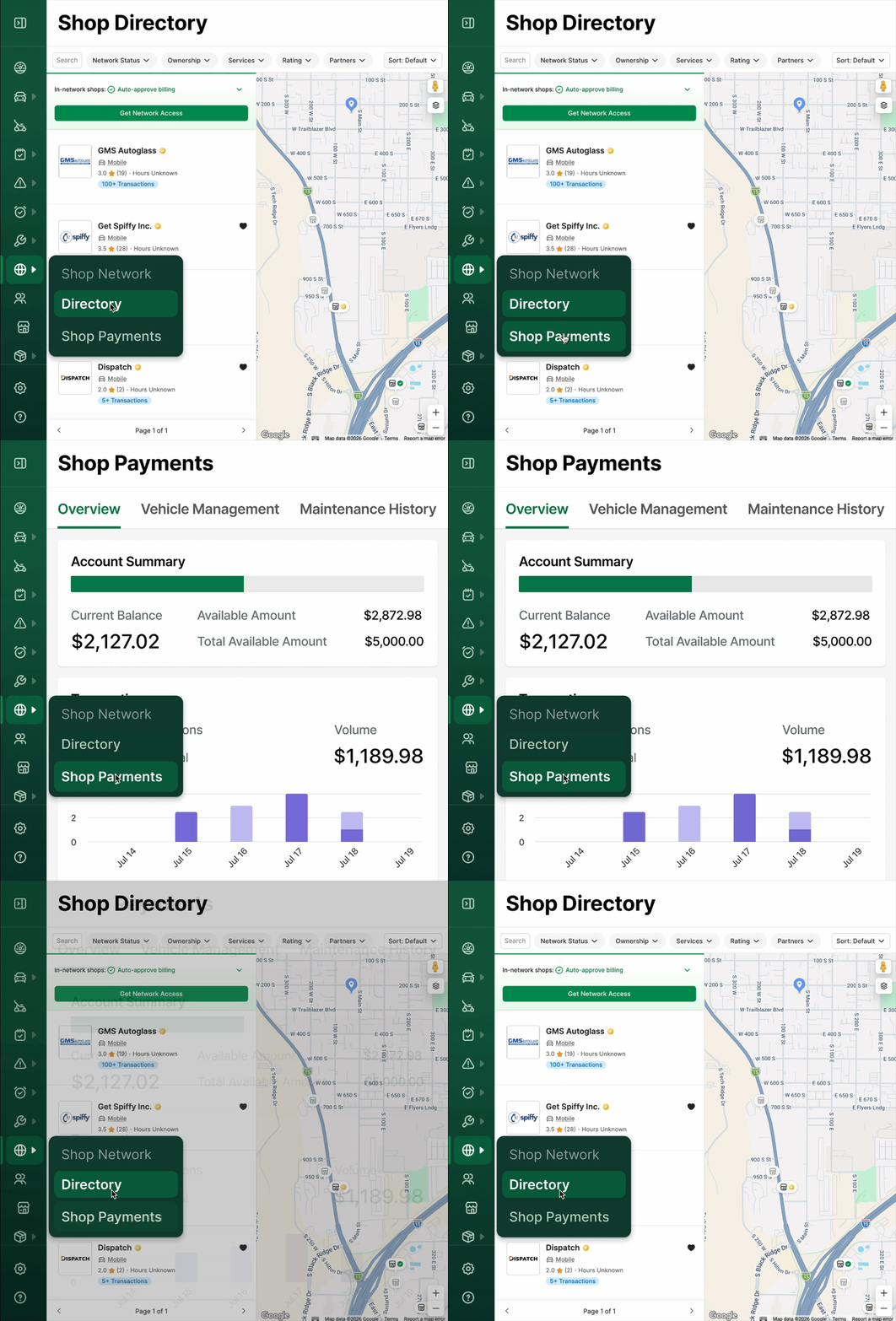
Prototype showcasing different user flows from Directory to Shop Network onboarding before and after the experiment.

Lasting Impact

As of August 2026, the persistent banner is still live on the Directory page.

This experiment made the team more confident about surfacing Shop Network in more areas of the product. The combination of a persistent presence and a shorter path also became a playbook for later experiments.
Not every bet pays off cleanly. Sometimes the result is confusing, sometimes it surprises you, sometimes it just tells you what to try next. That is the point of experimenting: to learn and iterate. The next one did all three.
Experiment 2 - Shop Network Nudge on Issues Page

Problem

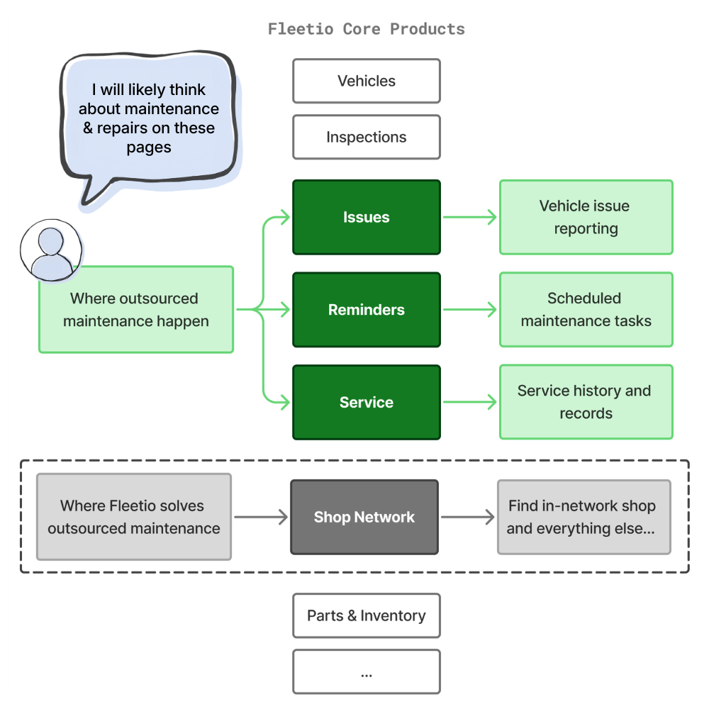
Since launch, there was exactly one way to discover Shop Network in-product. Find and click Shop Network on the nav menu, then land on the Shop Directory page. Even then, we had to hope users would connect the dots and realize it was a feature built for outsourced maintenance.
This structure put Shop Network in a complete silo, which significantly hurt both discoverability and motivation to enable:
  • Limited to a single path to discovery, the top of the funnel stayed narrow
  • Missing from the workflows where maintenance needs arise, the value never had a chance to land

Solution

My theory was that we should showcase Shop Network and its value where outsourced maintenance naturally occurs in a user's workflow. Pages such as Issues, Service Reminders, Service History, and even Vendors are great candidates, and that's a lot to implement all at once. I wanted to validate my theory first, testing it on one surface before we committed to more. Since the Issues page had the most traffic, it became the playground for this growth experiment.

I wanted the design to lead with value to motivate users, so I decided to create a new card component, which offered enough real estate for both value propositions and CTAs. After several rounds of exploration and feedback sessions, the team and I picked the two strongest versions. They took different strategies to capture the user's interest, so we tested them head-to-head.

Design Details

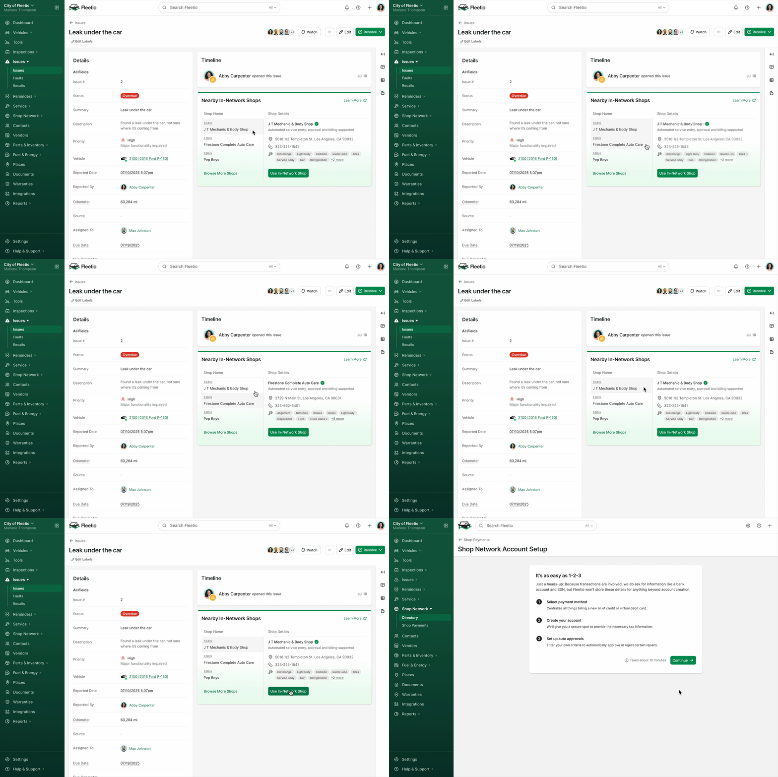
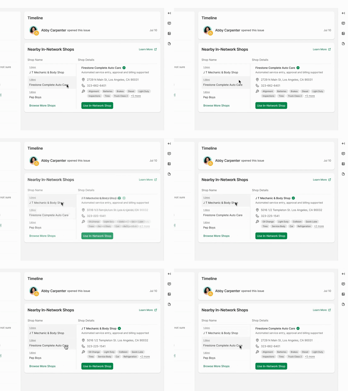
Variant A - Personalized card showing nearby shops

  • Dynamic card content based on user location data
  • Leveraging the Shop Directory data to show the 3 closest in-network shops with details
  • Not dismissible on purpose to blend in as part of the page rather than a promotion
  • Primary CTA: Use In-Network Shop, directing users to Shop Network onboarding page

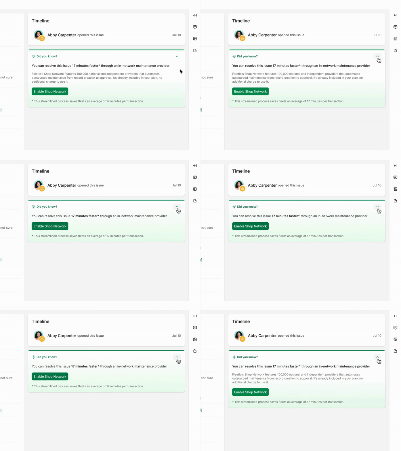
Variant B - Simple "Did you know" nudge

  • One value proposition in plain text, maximizing relevancy
  • Reusing the CTA banner design on Shop Directory with a green gradient background as a visual attraction
  • No secondary action and collapsible, keeping the ask simple and to the point
  • Primary CTA: Enable Shop Network, directing users to Shop Network onboarding page

Post-Enablement Design

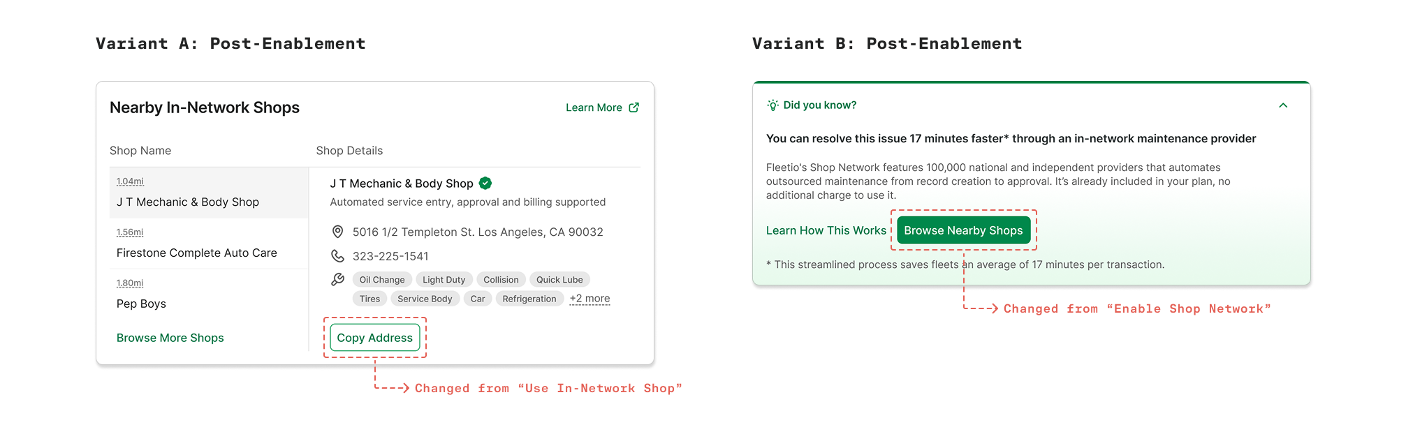
Both variants were designed to stay useful after Shop Network enablement instead of disappearing.

It only takes one user from an account to enable it. If the nudge vanished right after, everyone else on that account would have missed the chance to discover the feature at all. Shop Network's discoverability problem was never exclusive to pre-enablement. I made sure that the nudge continued to work on the page so every user in an enabled account would be reminded to use it.

Here's how the post-enablement designs changed to continue driving discoverability:

Experiment Design

The original Issues page offered no path to Shop Network, so there was no valid enablement data to use as a control. We discarded the original design and split traffic between the two treatments.

This experiment was implemented as an A/B test with an equal split of traffic to Variant A and B.

Initial Results

The experiment ran through the entire month of September. In that month, each version was exposed to roughly 7,200 users, and we recorded a 1% enablement rate for Variant A and 2.2% for the other.
Metric Variant A Variant B
Issues page nudge impressions 7,219 7,211
Desired CTA clicks 75 156
Conversion to Shop Network onboarding start 1.0% 2.2% (winner)
Together, that was 231 users going directly from the Issues page into Shop Network enablement, on a page that had offered no path at all. That was the answer we cared about. The comparison between the two versions got interesting, though: the plain text nudge pulled more than twice the interest of the rich, personalized card. I had expected the opposite, so it made me wonder why.

I pulled the team together to discuss the result, and we noticed that the two designs had too many variables to be truly comparable. They differed in both content and visual treatment, so we could not tell whether the plain nudge won on its message or on how it looked. So we decided to run another test, this time with a new treatment that kept the nearby shop content but with the same visual treatment as the plain text nudge.

Retested Results

The retest offered a fair opportunity for the nudge content to compete. It ran for another month from October to November.

Now with the visuals controlled, the personalized version edged ahead. Though the numbers were close, we could see that the plain text version did not win solely on content in the previous test. The new personalized card was rolled out to 100% of users.
Metric Variant A 2.0 Variant B
Conversion to Shop Network onboarding start 1.5% (winner) 1.2%
Evolution of the Issues page nudge design from first test to retest. Variant A 2.0, the redesigned personalized card, won in the end.

Lasting Impact

The importance of this experiment was not which version won, but the validation of the theory that surfacing Shop Network in relevant product areas drives both discovery and enablement. The Issues page went from no presence to a working entry point.

Today, Fleetio runs Shop Network nudges on all of these pages: Issues, Service Reminders, and Service History. Though the design has been through other hands since, the idea remains the same.
Learnings
The messy parts taught me more than the straight wins. The most important thing I learned is to ask more questions when numbers can't explain what really happened. The fact that I was surprised by the Issues page experiment result made the team re-evaluate the designs, and we eventually realized that the initial test wasn't completely fair.

So for future growth design projects, I will apply these learnings: